
When it comes down to product packaging and labeling, it is essential to consider the fonts you use. A font that people can’t read properly can lead to a lot of possible issues, including the inability of customers to read the information associated with your product and the emergence of false information about your company and your products.
The way to select a font for a product label or for your packaging should follow a few strict guidelines in order for success to be attained:
- Start by designing your label and package and determining exactly what text to use on it. Make sure you include information like product ingredients and any important details that the FDA would require you to add.
- Use computer software to arrange the text and see what it would look like on the package and label. If it’s not easy to read or large enough, you will have to make modification.
- Print a basic version of both the package and the label (possibly including some basic graphics and color options) to see if everything you add is easy to read or not.
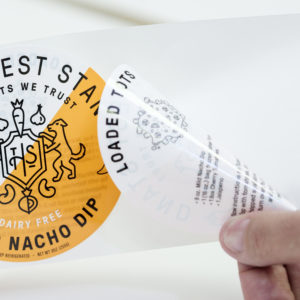
- Change the font and layout of the text and graphics, until you get a good result. This process might be somewhat lengthy, but you will get the results you want, and they will make sure that your product is properly represented on the shelves from which buyers will purchase it. For peel back labels will have a much smaller font, still readable, and will allow you to put all the necessary product information on the label.
Original Post on: Evaluating the Most Popular Fonts for Product Packaging – What Factors Should You Consider?
No comments:
Post a Comment